
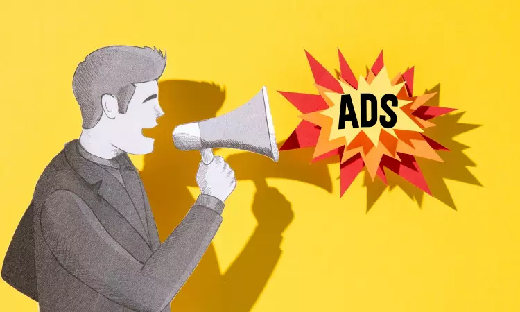
Writing good advertisement is the goal to get more engagement for advertising so people will buy more of your products. There are common ads mistakes. To sell your products, you don’t want to write bad advertisements. There are huge Ad-Agencies who make mistakes and write bad advertising. You don’t want to such mistakes. And how you can write better advertisings and get more engagement, so read till the end. If you want to make 5-6 figures from your business and want to learn more then subscribe to our newsletter, we will not spam in your inbox:
Table of Contents
Good examples of bad advertising
We advertisers thought that debate was already over. But seems like it’s not. That is why advertisers are still using “reverse type” and companies are sending their money down the toilet by hiring such advertisers.
What is reverse type
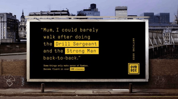
The reverse type is using or creating an advertisement opposite to the normal, original way of advertising. The opposite way is to have background set in dark and having font in contrast to it, so the typeface pops out. The original way to do is have white background and have black or similar colored typeface. This kind of advertising is used by people who want them to stand out or want to sound clever but not their client or clients’ advertisements. They create such ads. Here’s an example of bad advertising:
What are consequences of reverse type
the main purpose of advertising is to make people read or let them know about your products or services. But reverse type advertising defeats that purpose. As you can the previous ad was difficult to read. You cannot read it from far or at very long distance. I will tell you latter as how to make sure people can read your ad from far, stay till the end.
It doesn’t matter what kind of typeface or colored typeface you use in your advertisement if your background is set in black or similarly dark. I would recommend using Copper Black typeface with all capital letters. Why?
Because it would not make any difference as people are not going to be able to read your advertising anyways. You might think why am I being rude to you? Why shouldn’t I be? You are making stupid mistakes. You don’t try to be clever or want to stand out especially with the “reverse type”. You use what is working and use it till it stops working or gives you no results. That’s what being clever is. Its avoiding mistakes to not get negative consequences and since you do good thing, you get benefit from that as well. So, you get double the benefits.
Being clever is not stepping foot in place where it’s guaranteed to give you bad results. It’s about taking risk that you can avoid in the first place. But how you can know what works and what doesn’t? It’s easy and you were getting it wrong from the beginning. And that is to read book, articles and researches those were done in past. It will help you a lot as you don’t have to spend resources to find out what works and save time. And avoid bad results. So, what is the example of good advertising? Read along to find out and you will learn a lot.
Examples of good advertising
A great and effective way to write an advertisement is to not use reverse type.
Great advertising to persuade consumers
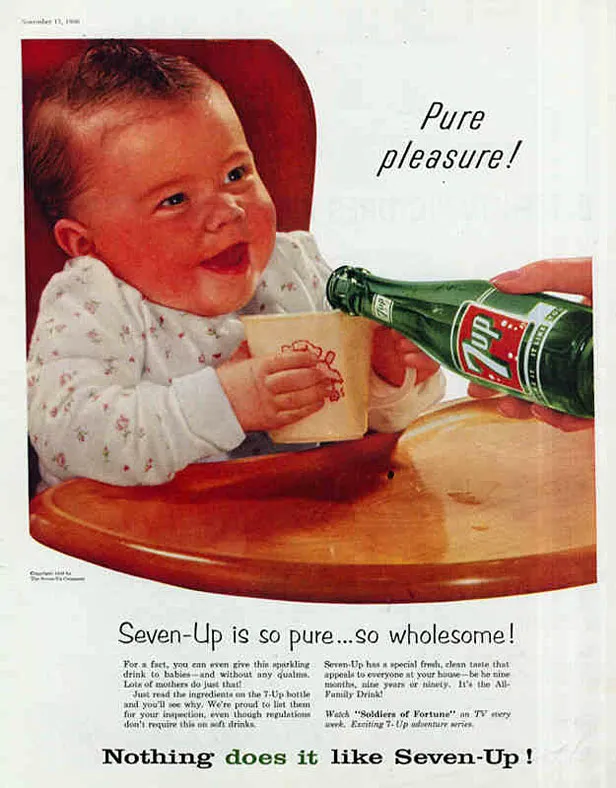
You do not use reverse type. You set background white and use typeface in contrast color to that white background. The good thing is to use black colored typeface on white background. Here’s example:
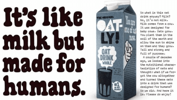
As you can see background is white and typeface is black. You can read it from further distance. It’s perfect in contrast. Yes, it is common type of advertising. Remember it works. And that is why you don’t try something that’s proven to be not working.
Yes, black background and yellow typeface is good contrast as well. But it doesn’t mean you will just go and use it. Anything that has good contrast is bad idea to use it in your advertising. For example, the following advertisement, can you read it from 50 feet away?
Simpler advertisements to get better engagements
If you don’t read that many papers and still want to create good advertisements and want your cash register to ring, then make simpler advertisements. Just like following advertisement that was done by Pearce Creative Group Bletchingley did for Oxford University.
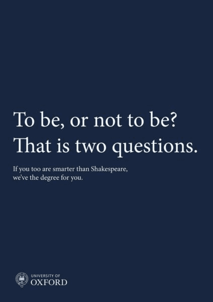
This is good example because you can truly read it, and you can read it from far. Not like another advertisement where advertiser try to stand out instead of making client’s advertisement stand out.
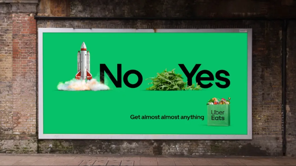
This is another example where advertiser wants to think client’s advertisement will stand out because it’s simple and has good contrast.
How to get more engagements for advertisements?
Your first goral or motive of creating an advertisement is to make it readable. Make sure people can read it from far away. It doesn’t matter how simple or good contrast your advertisement has, if people cannot read it then you flushed your money down the toilet.
How to create a better advertisement?
I will set advertisement’s background black, use dark purple font and typeface as Copper Black in all capital letters. I can advertise that I am giving away free gold in my advertisement but only to businessmen. Businessmen are busy and guess how many will show up to get free gold?
None. No businessman will show up even when I am advertising that I am giving away gold for free. Why did not a single businessman showed up to get gold for free from me?
Because my advertisement is not readable. They cannot read it from far. They have to come close enough to read it. My advertising did not catch their attention in split second. So, no one got free gold.
If I were to set advertisement background white and have Times New Roman typeface at bigger font stating that businessmen will get gold for free. Now my advertisement can be read from further distance. And want to guess how many will show up now? Almost every businessman. Key is to make your advertisement readable. Now you want to see how you can write effective advertisement then read this:
If you want to make 5-6 figures from your business and want to learn more then subscribe to our newsletter, we will not spam in your inbox:
Now if you are serious about your business and you want to continue to make 6-figures or more from your business and scale your business internationally then go ahead and own our business program. This is guaranteed to change and improve your business at least by 300%. If not and you are not satisfied with results then we offer money-back guarantee, visit here: The Business Program